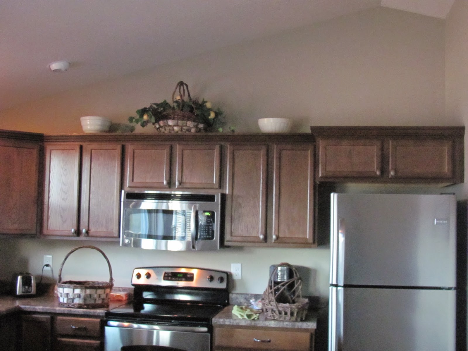
There was an article in our local paper about staging this weekend. With pictures! A stager was teaching real estate professionals how to stage a home. The woman said, "Always accessorize with a purpose. You don't want the attention on the accessories. You want the attention to be on the homes features." That resonated with me, especially since I have been looking at rental homes online. I notice I like the ones with minimal accessories. It is so much easier to imagine a space when it is just the basics. If I see a wrinkled towel hanging over the edge of the tub, it seems like someone was just there. Which is kind of gross.
So I thought I'd play with my kitchen and how it is decorated. Specifically the items above the wall cabinets. I'm curious what you think I should do. The first two pictures are how I have the cabinets normally decorated...which are okay for me usually.
Here are some options where I put fewer things on top of the cabinets
I like the one below better than the one above, which seems really sparse or not big enough for the space somehow. (Ignore that I put all the ones I wasn't using on the counter!)
It was getting darker as I was taking this picture so I realized I could turn on the under and upper cabinet lighting. Except for the bowls in the foreground, it could be any one's kitchen. Can't you imagine moving into this space more than the decorated space?
I decided to try putting something back up on top, but in a different way to see if it created a better feel in anyway. How do you feel about this one?
Then I added the bowls back in. Hard to see one of them I think.
Is there one that draws you in more than the others? Which one feels lighter? I'm open to suggestions or your thoughts and opinions. I'm not a designer by any means. I just want to sell my house and have it be appealing to as many people as possible. :)


I like pic #4 best. I think it feels heavier in pic 8 when the larger basket is above the fridge area but that might be me. I like the small basket being above the fridge area, that feels right.
ReplyDeleteI REALLY like pic 5
DeleteYes, I'm definitely leaning towards pic 5, too. Which is nothing up there! Thanks for your feedback.
DeleteIMHO, (having no particular décor expertise to speak of) I like 5 as well. It keeps it clean and simple and I think the openness of the wall above the cabinets pulls the eye up.
ReplyDeleteI actually quite like number 6! Since there's something at the far/tall end of the cabinets, it's going to catch your eye, and make you look up. In number 5, with nothing there, it's you may look up, you may not - we are all looking up because we're comparing. Someone looking at a house may not be so inclined to do that.
ReplyDeleteThen again, I've got no real basis for any of this, other than watching far too much HGTV xD